CSS Transforms, Transitions, and Animations
Transforms
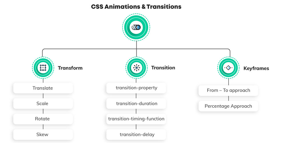
The transform property applies a 2D or 3D transformation to an element. This property allows you to rotate, scale, move, skew, etc., elements.
-
For Transform Default value:- none
-
For Transform Inherited:- no
-
For Transform Animatable:- yes
-
For Transform Animatable Version:- CSS3
-
For Transform JavaScript syntax:- object.style.transform=”rotate(7deg)”
Syntax
transform: none|transform-functions|initial|inherit;
Property Values
| Value | Description |
|---|---|
| none | Defines that there should be no transformation |
| matrix(n,n,n,n,n,n) | Defines a 2D transformation, using a matrix of six values |
| matrix3d(n,n,n,n,n,n) | Defines a 3D transformation, using a 4x4 matrix of 16 values |
| translate(x,y) | Defines a 2D translation |
| translate3d(x,y,z) | Defines a 3D translation |
| translateX(x) | Defines a translation, using only the value for the X-axis |
| translateY(y) | Defines a translation, using only the value for the Y-axis |
| translateZ(z) | Defines a 3D translation, using only the value for the Z-axis |
| scale(x,y) | Defines a 2D scale transformation |
| scale3d(x,y,z) | Defines a 3D scale transformation |
| scaleX(x) | Defines a scale transformation by giving a value for the X-axis |
| scaleY(y) | Defines a scale transformation by giving a value for the Y-axis |
| scaleZ(z) | Defines a 3D scale transformation by giving a value for the Z-axis |
| rotate(angle) | Defines a 2D rotation, the angle is specified in the parameter |
| rotate3d(x,y,z,angle) | Defines a 3D rotation |
| rotateX(angle) | Defines a 3D rotation along the X-axis |
| rotateY(angle) | Defines a 3D rotation along the Y-axis |
| rotateZ(angle) | Defines a 3D rotation along the Z-axis |
| skew(x-angle,y-angle) | Defines a 2D skew transformation along the X- and the Y-axis |
| skewX(angle) | Defines a 2D skew transformation along the X-axis |
| skewY(angle) | Defines a 2D skew transformation along the Y-axis |
| perspective(n) | Defines a perspective view for a 3D transformed element |
| initial | Sets this property to its default value. |
| inherit | Inherits this property from its parent element. |
The transform-origin property allows you to change the position of transformed elements.
2D transformations can change the x- and y-axis of an element. 3D transformations can also change the z-axis of an element.
The transform-style property specifies how nested elements are rendered in 3D space.
Note: This property must be used together with the transform property.
Transitions
The transition property is a shorthand property for:
- transition-property
- transition-duration
- transition-timing-function
- transition-delay
Note: Always specify the transition-duration property, otherwise the duration is 0s, and the transition will have no effect.
-
For Transitions Default value:- all 0s ease 0s
-
For Transitions Inherited:- no
-
For Transitions Animatable:- no
-
For Transitions Animatable Version:- CSS3
-
For Transitions JavaScript syntax:- object.style.transition=”all 2s”
Syntax
transition: property duration timing-function delay|initial|inherit;
| Value | Description |
|---|---|
| transition-property | Specifies the name of the CSS property the transition effect is for |
| transition-duration | Specifies how many seconds or milliseconds the transition effect takes to complete |
| transition-timing-function | Specifies the speed curve of the transition effect |
| transition-delay | Defines when the transition effect will start |
| initial | Sets this property to its default value. Read about initial |
| inherit | Inherits this property from its parent element. Read about inherit |
CSS Animations
CSS allows animation of HTML elements without using JavaScript or Flash!
An animation lets an element gradually change from one style to another.
You can change as many CSS properties you want, as many times you want.
To use CSS animation, you must first specify some keyframes for the animation.
Keyframes hold what styles the element will have at certain times.
The animation-timing-function property specifies the speed curve of the animation.
The animation-timing-function property can have the following values:
ease- Specifies an animation with a slow start, then fast, then end slowly (this is default)linear- Specifies an animation with the same speed from start to endease-in- Specifies an animation with a slow startease-out- Specifies an animation with a slow endease-in-out- Specifies an animation with a slow start and endcubic-bezier(n,n,n,n)- Lets you define your own values in a cubic-bezier function