RESPONSIVE WEB DESIGN and FLOATS

Responsive Web Design
Responsive building a website is to build a website suitable to work on every device and every screenResponsive web design is, Desktop computer and cell phone users alike all benefit from responsive websites.
Responsive vs. Adaptive vs. Mobile
Responsive and adaptive web design are closely related, and often transposed as one in the same.
Adaptive means to be easily modified for a new purpose or situation, such as change.
Responsive generally means to react quickly and positively to any change, while adaptive means to be easily modified for a new purpose or situation, such as change.
Mobile, on the other hand, generally means to build a separate website commonly on a new domain solely for mobile users.
Responsive web design is broken down into three main components, including flexible layouts, media queries, and flexible media:
-
Flexible Layouts:
Flexible Layouts is the practice of building the layout of a website with a flexible grid, capable of dynamically resizing to any width, built using relative length units, most commonly percentages or em units. These relative lengths are then used to declare common grid property values such as width, margin, or padding.
-
Flexible Grid:
Using the flexible grid formula we can take all of the fixed units of length and turn them into relative units. For even more control within a flexible layout, you can also leverage the min-width, max-width, min-height, and max-height properties.
-
Media Queries#media-queries:
Media queries were built as an extension to media types commonly found when targeting and including styles.
Example:
HTML
<!-- Separate CSS File -->
<link href="styles.css" rel="stylesheet" media="all and (max-width: 1024px)">
CSS
/* @media Rule */
@media all and (max-width: 1024px) {...}

/* @import Rule */
@import url(styles.css) all and (max-width: 1024px) {...}
Each media query may include a media type followed by one or more expressions. Common media types include all, screen, print, tv, and braille. The HTML5 specification includes new media types, even including 3d-glasses. Should a media type not be specified the media query will default the media type to screen.
Logical Operators in Media Queries:
Logical operators in media queries help build powerful expressions. There are three different logical operators available for use within media queries, including and, not, and only.
Example:
@media all and (min-width: 800px) and (max-width: 1024px) {...}
Orientation Media Feature:
The orientation media feature determines if a device is in the landscape or portrait orientation.
@media all and (orientation: landscape) {...}
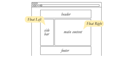
Float CSS:
The float property is used for positioning and formatting content e.g. let an image float left to the text in a container.
The float property can have one of the following values:
left- The element floats to the left of its container.right- The element floats to the right of its containernone- The element does not float (will be displayed just where it occurs in the text). This is defaultinherit- The element inherits the float value of its parent
CLEAR:
Before clear:
After clear:
#footer {
  clear: both;
}
Collapse:

If the block element on top were to have automatically expanded to accommodate the floated element, we would have an unnatural spacing break in the flow of text between paragraphs, with no practical way of fixing it. If this were the case, us designers would be complaining much harder about this behavior than we do about collapsing.
Collapsing almost always needs to be dealt with to prevent strange layout and cross-browser problems. We fix it by clearing the float after the floated elements in the container but before the close of the container.
The vast majority of websites out there use a grid. They may not explicitly have a grid system in place, but if they have a “main content area” floated to the left a “sidebar” floated to the right, it’s a simple grid.